
Character Art from scratch
- trappes
- Mar 21, 2022
- 4 min read
So I started this here boardgame. It happened quite by accident, I was planning a D'n'D campaign, and it all kinda ran away from me. The one thing that I always enjoyed most about Dungeons and Dragons was the character designs I got to do. So when I started this and truly got into it, I was excited to start designing a HUGE cast of characters to populate the world. That meant drawing. And to my mind the best way to get that crisp clean comic book line was vectors. Lets have a look at how I did it!
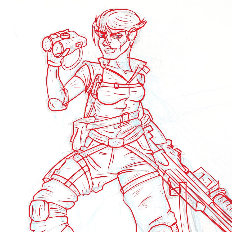
Take the soldier class, Lt. Shakti Bajwa. The first thing I did, after many, many rounds of concept sketches was draw out a suitable "Hero pose"

Coming from an animation studio I always saw people starting with a blue line sketch of the basic anatomy. Taking this I drew in the details on paper with H2 pencil and scanned the image. I know it's a little oldschool but for me the tactile pencil on paper feel helps me get to grips with the character. I feel like I am actually creating a person! But your concept sketch is always your start, however you do it. Excellent programs like Sketch and Procreate are super handy for this stage too.

After this I pulled the image into Adobe Illustrator. Set the image on a layer underneath your working layer at 50% opacity and lock it!
Next taking the pen tool, I went over the design, smoothing out lines where needed, adding extras, and adjusting as necessary. Its a handy way to remove any kinks in the image before we get too far down the rabbit hole!
Don't worry about the overlaps, if anything make sure you have them! We will be cleaning up the linework later on, right now we just want to make sure that we have strong corners with no gaps.
Once the outlines are all in, we adjust the stoke and width profile of the vectors. This gives us a nice dynamic line. Get creative about this, there's lots of scope for differences in width and profile. You can adjust them manually with Command+W (Ctrl+W on PC) but I like to keep a good library of width profiles saved to my Strokes tab to speed things along.
Once your done here it's Anchor Points Away! Make sure you group your lines and duplicate it in case you have to go back and adjust, then We do an Expand Appearance, followed by a regular Expand All for good measure.

With whole group selected, hit "Divide' on your pathfinder tab. This is gonna be the tedious part, but now it is time to go over the whole thing and delete those overlaps from earlier. I know it seems a bit unnecessary but it allows for you to make sure that your lines are where they need to be. Remember it's always easier to take things away than try to fix what isn't there!
Once we are done, you have two options, either colour each line section if you want a specifically coloured line for skin tones etc. or (as in this case) set your fill to black. If your working with print, make sure to use a rich black (eg C50 M50 Y50 K100) to ensure that it doesn't appear washed out.

OK Time to colour! There are a few ways to do this, Always do the one that works for you. in my case, given that I'm a vector nerd, I did the following:
Step one, merge your black lines so that you have solid shapes and not a bunch of little pieces after the divide filter did it's thing.
Next duplicate your group and hit "unite" on the duplicate only. This will give you a solid shape. I recommend filling this shape with a colour that won't be in the final image.
Place the duplicate beneath the line work only group and hit "Merge" on the two of 'em. This will cut the shapes out from the line work so that you can select and colour them at your leisure!
Lastly do a bit of cleanup. Make sure that you delete any shapes that don't have a fill or stroke, along with any that are still that colour you chose for the solid shape. I tend to be very cautious here and do a final pass in outline/wireframe mode to make sure there are no gaps to fill. but once that is done then it's time to add bit of texture.

So, taking the whole coloured group I paste into photoshop as a vector smart object. Then using the brush tool, go colour by colour adding clipping masks and applying overlays with Multiply, linear Burn, Screen, Colour dodge and Overlay filters until I get the desired result.
Always make sure you have a good brush pack, it really makes the difference and add a more unique quality to the image.
But.. yeah! there you go! that is my step by step for the characters I make. let me know what you thought of it and if you have any questions or suggestions please feel free to comment or contact me!


Comments